Brand Strategy | Campaign | Merchandise
reborn coffee LA
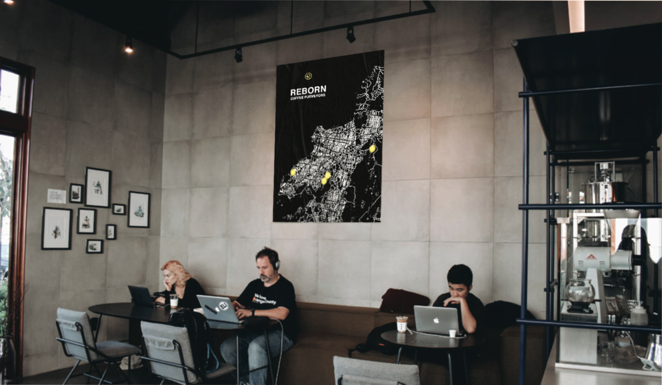
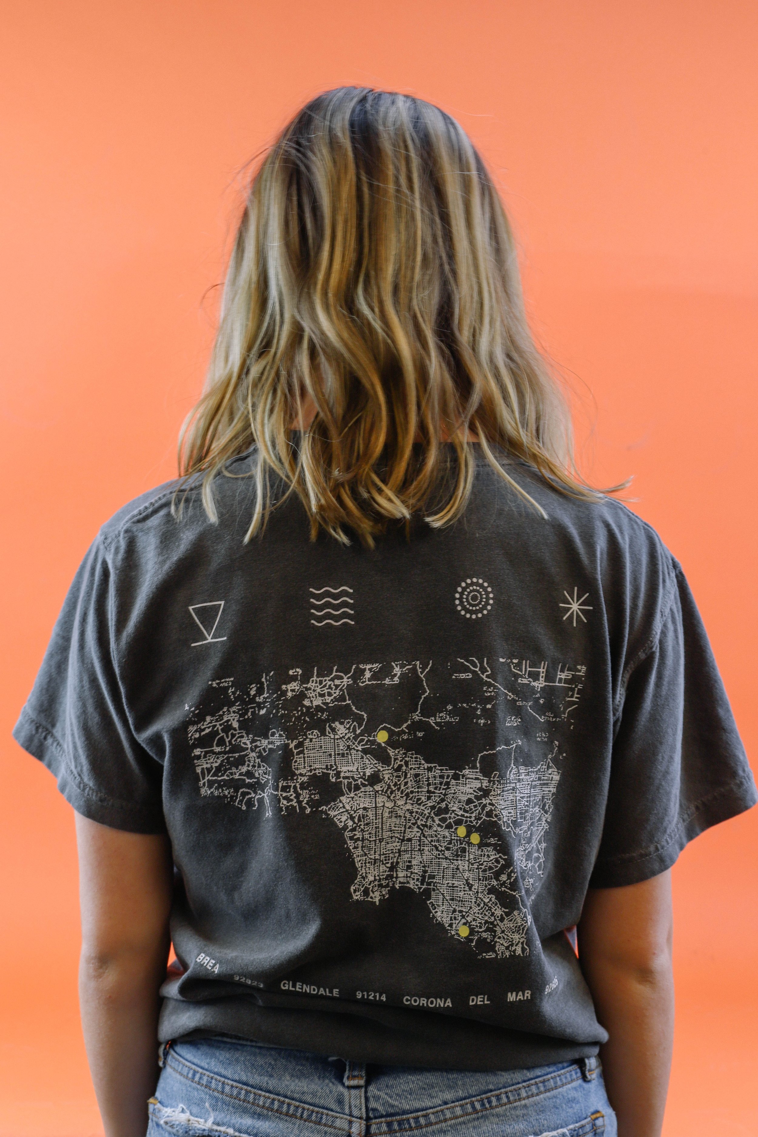
Reborn Coffee is a small business chain of coffee shops in Los Angeles, California. In addition to selling good and preparing coffee, Reborn brews their own beans locally. Reborn emphasizes heavily on delivering high quality coffee for its consumers.
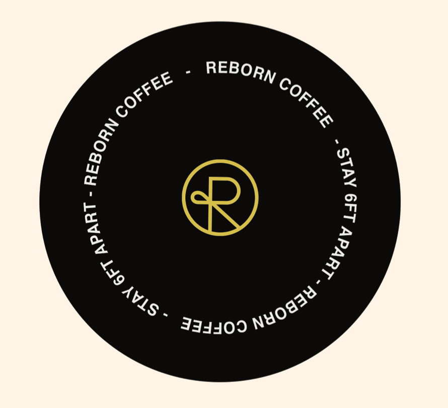
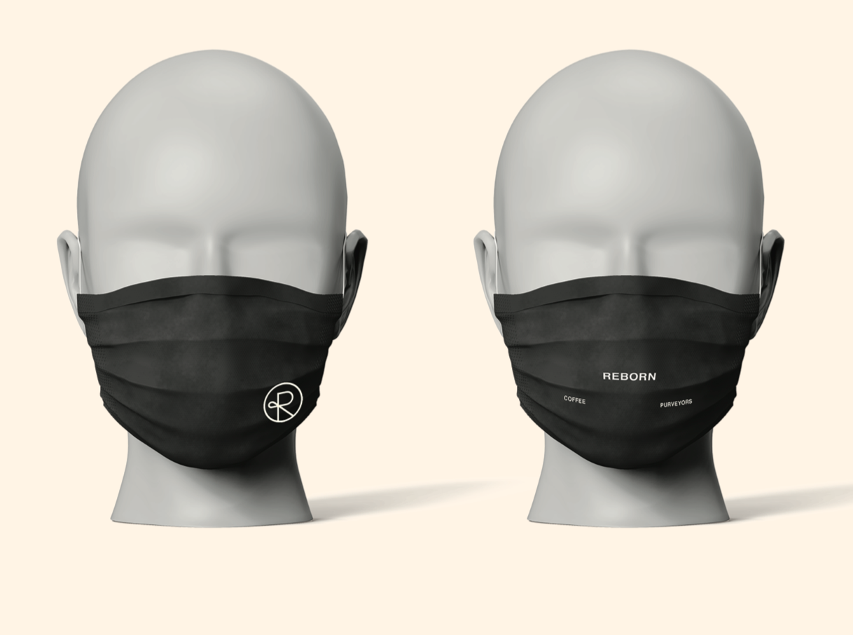
The already existing logo was created by another designer, which is the capital “R” enclosed by a circle form. Jacob and Hailey expanded the logo into the written “Reborn Coffee” with “coffee purveyors” as a slogan below. Purveyors represents Reborn’s love and passion for producing unique, high quality coffee beans for its community. Because quality is verbally emphasized in the CEO’s language, it was important to include the same language on the employees uniforms and throughout the storefronts.
Halfway through this project, the city of Los Angeles enforced social distancing and mask wearing in every public space. Jacob and I translated what began as a law enforcement into a marketing opportunity by designing one of a kind face masks and vinyl floor stickers for the storefronts.
A takeaway from this project was understanding and directly communicating with leadership within a company. It is important for designers to learn the heart behind the brand. What the companies needs are along with what the company wants to communicate with the world. For Reborn, it is brewing and serving the best quality coffee.
Collaborators:
Jacob Aleman - Communication Designer | Partner